Advertorial Awareness Campaign
My Idea:
Grow your own crops / local food. stop using food filled with chemicals and poisoned by travel. encouraging people to set up their own micro farms in the back garden to help the environment and save their kids future.
Narrative:
Why waste money buying chemical full fruit and veg when you can just
grow them at home and possibly become a little source of food for your
neighbours. Think about your kids future! and let them have fun with farming, its is Norfolk! Be sustainable!
Visual Concept: Lots of earthy colours accompanied by big clear stand out text. Clip arts to mix fun and contrast serious. Simple design so it's quick and easy to read on the go.
Three Methods:
Online Web Banner
Bus Banner
Door Drop Leaflet
What's My Target Audience?
- I think my target audience should sit somewhere between 20s - 40s. the reason for this is that its the time frame of people having kids or having growing kids, which means they will be thinking about their kids future more and more each growing day. Its the parents fault their kids wont have a future
- Since I'm using Norfolk as the location demographic I think because we're such a farming county I can use that as an advantage.
Press Release:
https://tinyurl.com/RyanStottPressRelease
Headline:
Grow Your Own!
Sub Header:
Why Buy Veg That’s Travelled Hours & Full of Chemicals!?
Individual Media Copy:
Web Banner:
No more poison! Leave the pesticides in the shed. Grow your own!
Drop Leaflet:
- Short statements bullet points
- Saving money
- Why are you paying high prices for fruit and veg from other countries?
- Why are you supporting the carbon footprint produced by the importing?
- Why aren’t you growing local!?
- You can grow better fruit and veg in your own garden!
- No wasting money on expensive imported apples and pears
- Become self-sufficient! Become independent!
- *QR CODE*
- Be a part of the bigger picture, help the world grow.
- Save your money and have more delicious fruit and veg in your own garden!
- Use QR codes
Bus Banner:
Its Your Fault. Be the change, for their future!
Research into the 3 different types of media I'm going to use:
Online Web Banner:
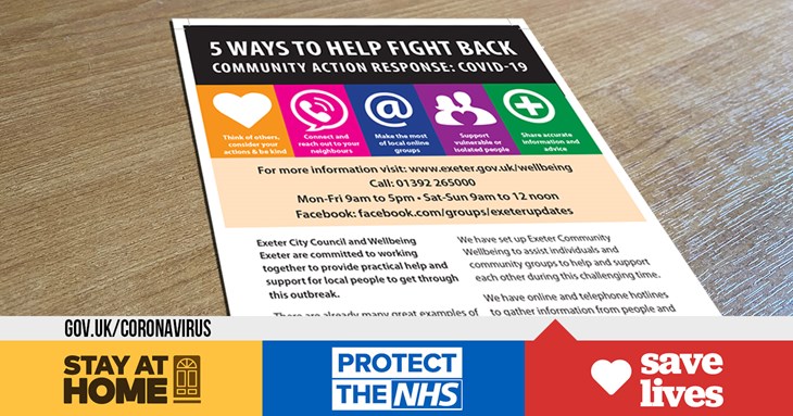
Door Drop Leaflet:
 |
| A |
Bus Banners:
Simple and snappy since they wont be seen for a long time and not upclose. idealy youd want the brand logo/ heading/ subheading and an image. just needs to be easy to read, eye catching and very much on brand.Graphics For Banners:
Development of Graphics
Bus Banner:
Improving The Design to fit the message:
Final: Simple, straight to the point, direct address, eye catching.
Web Banner
Drop Leaflet
 I think the campaign works because at its core it is simple, just grown your own veg, its Norfolk! It makes the audience think about what they could be doing and what they could be doing for the future of their children. It also makes them question why their not growing at home, it saves money, it saves fuel, its healthier and it tastes better. Where will the items be seen? well, ideally the buses with travel all around Norfolk and further to expand the movement. For the drop leaflets its too ambitious to drop them at every house in the county so i think it will be good to drop them around kings Lynn, and small villages that are a decent travel from shops so the fact you can save money is more appealing and there will be lest carbon emissions in these villages
Plan For Project: 08/10/2020 - 23/10/2020
- Refine and reorganise text on the blog, have a full read through and correct mistakes
- Expand my research and have it be more clear.
- More screen grabs of the design progress to show start to finish.
- Actually Finish the designs and have them exactly how i want them.
- Proof check everything again


Comments
Post a Comment